


The success of a UI relies on how well-designed its UI elements are, since they play a critical role in providing a seamless and enjoyable experience to the users. The following UI elements allow users to interact with digital products such as websites or mobile applications in a simple and intuitive way.
UI Elements
Colour
Colour is a crucial part of any UI design that helps create an emotional connection with users, having a significant impact on the user’s impression of your brand. It is used to create a visual hierarchy, highlight important elements and create contrast. Colours make your product look more visually appealing while directing the user’s attention to a specific part of the interface where you want to guide your users to.
Typography
When designing an application or website, it is an indispensable fact that text forms a massive part of your product. It’s important to choose a legible font and size, maintaining consistency throughout your design since the text is what sells your product at times. Typography is also used to create a sense of hierarchy with the use of larger and bolder text to highlight important elements.
Navigation
Navigation allows users to move through your interface and find the information or features they’re looking for in your application or website. Navigation also determines the level of usability of your product, making it a priority in the mind of designers right from the early stages of UI design. A well-navigable allows users to interact with your product successfully, fulfilling their goals of using their product or website.
Buttons
Buttons allow users to interact with your interface and complete actions. The usage of clear and consistent button design throughout your interface plays a significant role in how users interact with your app or website. As with colour and typography, buttons also help create a sense of visual hierarchy, easing out the experience of user interaction with your product.
Forms
Forms are critical in UI design for collecting information from users such as contact information or login credentials. While designing forms, it is important to keep in mind the usage of clear labels and interactions. This keeps the forms as simple as possible, avoiding confusion and providing only the necessary fields that are required to collect the desired information. Forms should be thoroughly tested to ensure they are easy to use and intuitive.
Let’s take a closer look into the two primary UI elements, colour and typography, with more detail and a time travel to the medieval inspirations.
Colour
Importance of Colour in UI Design
Colour is an essential UI element that makes or breaks user experience. Colours are used to convey important information like the status of a button or the severity of an error message. Hence, it’s important to choose the right colours for your design since different colours have different emotions and evoke different emotions.
For example, red can be used to convey urgency or danger, while green can be used to give a sense of calm or approval.
Best Practices
1. Understand colour theory
2. Choose the right colour palette
3. Use colours consistently
4. Limit the number of colours
5. Use white space to balance colour
BRINGING MYSTICAL WORLDS TO LIFE WITH COLOUR

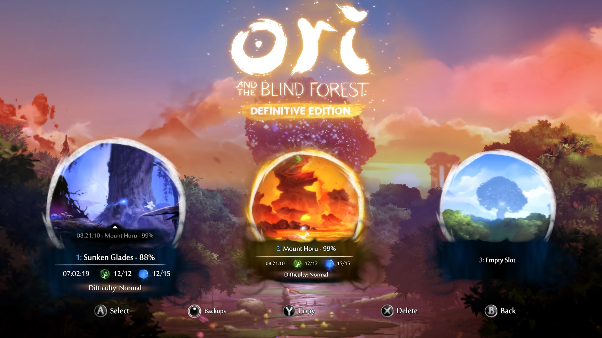
THE UNICORN TAPESTRIES AND ORI AND THE BLIND FOREST VIDEO GAME
The Unicorn Tapestries created around 1495-1505 and ‘Ori and the Blind Forest’, first released in 2015 demonstrate the importance of colour in UI design.
The Unicorn Tapestries used colour to create depth and realism, with subtle variations of hue and tone used to convey texture and shading. Similarly, in Ori and the Blind Forest, vibrant, saturated colours are used to create a sense of wonder and awe for the user in the game’s mystical environments.
Typography
Importance of Typography in UI Design
Here’s an example of what typography means for a UI design.
Typography makes a big impact on the user experience. Choosing the right font and size goes a long way in ensuring a sense of hierarchy in your design, guiding users through your interface and establishing your brand identity. The usage of bold and italic text aids you in the purpose of highlighting the important elements. When used effectively, typography solves a lot of problems in your design, creating a cohesive and engaging experience.
Best Practices
1. Choose legible fonts
2. Keep it simple
3. Maintain consistency
4. Pay attention to alignment
5. Keep in mind, most people don’t read (jk)
READING BETWEEN THE MEDIEVAL AND MODERN LINES

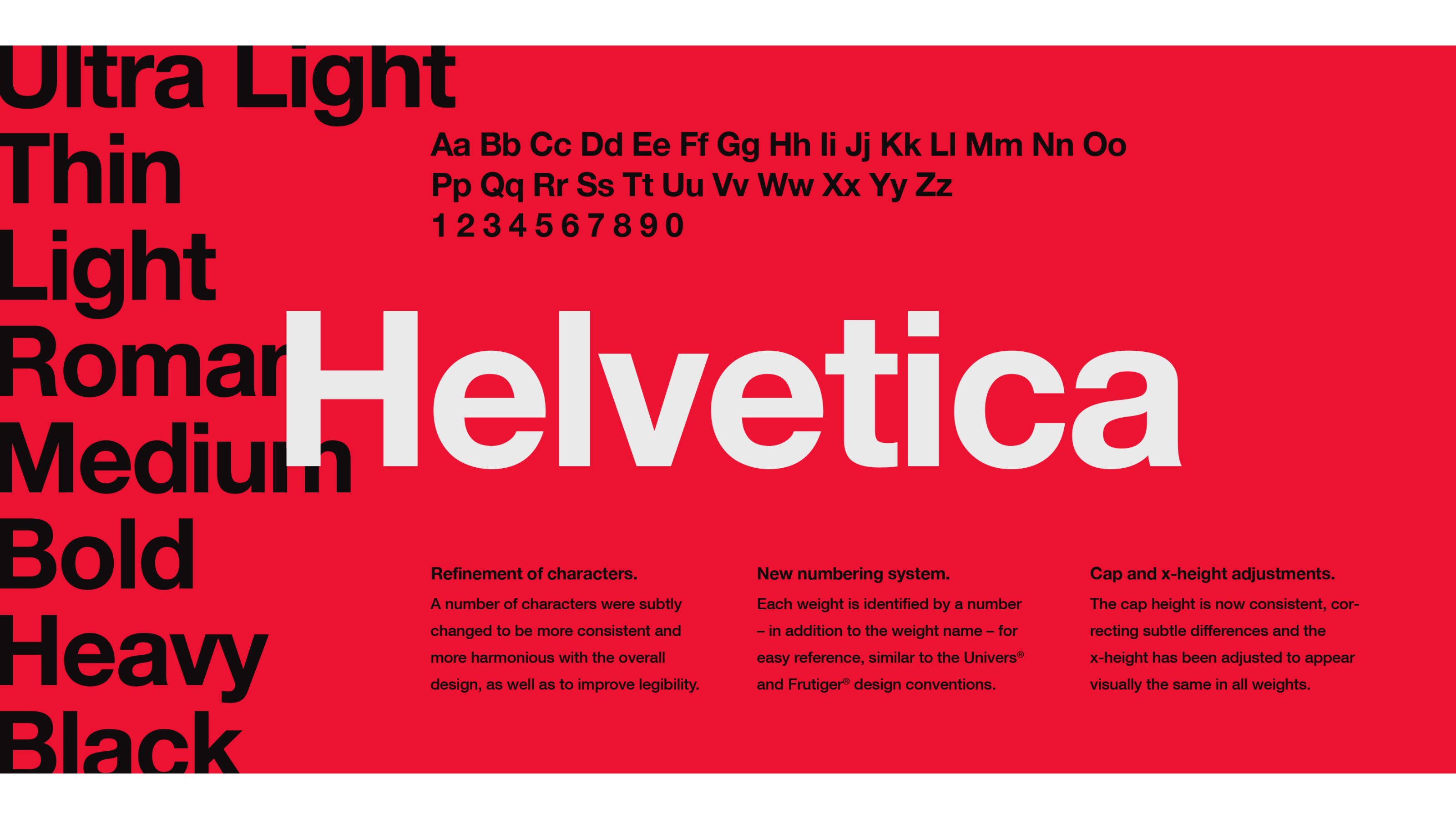
CAROLINGIAN MINUSCULE AND HELVETICA
Throughout history, typography has played an important role in UI design.
Carolingian minuscule, developed in the early Middle Ages, was a breakthrough in calligraphy due to its legibility and uniformity, making it easier for readers to understand and engage with written texts. Fast forward a few centuries. In the 1950s, the Helvetica font was developed and was famous for its clean lines and legibility, making it a popular choice in modern UI design.
Both Carolingian minuscule and Helvetica demonstrate the importance of typography across ages in UI design. They were designed to enhance the user’s ability to read and engage with the content presented to them.