


The world of UI/UX design is constantly evolving and staying up to date with the latest trends and technologies is a no-brainer. However, sometimes we can just pause the forward-running thoughts of our brain train and have a reminiscing look at the past, medieval in our case.
Before jumping into the intricacies surrounding the UI elements, let us take a brief look to understand the rules and principles of interface design.
UI Principles
User control
A good UI enables users to feel like they are in control, providing easier navigation options. It is achieved by giving clear options and buttons to the users, providing immediate feedback whenever they interact with the UI. For example, if a user clicks a button, a clear indication that the desired action has been completed helps them feel in control of the interface.
Clarity
Clarity is one of the primary indicators of a well-designed UI. The UI should be easy to understand and navigate, with clear language and visual cues. This is achieved by various things like size, colour and positioning of various elements. A well-executed UI design with better interaction techniques helps grab your user’s attention instantly. And research says, you only have 8 seconds to grab a user’s attention, making clarity in UI design, an absolute necessity.
Familiarity
Human beings are creatures of habit, who find comfort in a sense of consistency. This becomes more important in the case of UI design, where users build a high level of familiarity while interacting with common design patterns and elements. The more familiar the user is with your interface, the more easily they will come back, increasing user retention.
Hierarchy
A strong visual hierarchy corresponds to a successful user interface. The principle of hierarchy in UI is about using visual cues to direct users’ attention to the required area or elements on the screen. Ensuring visual hierarchy in the user interface ensures that the users see the most important information first, followed by other parts of your UI.
Flexibility
From novices to experts, ensure your UI is efficient for all kinds of users. The principle of flexibility is also about making your UI adaptable to different screen sizes and devices. It ensures easier usage of your UI for both desktop and mobile users. Keeping UI flexibility in mind allows easy learning for new users while helping the existing ones speed up their interaction processes.
FROM THE MIDDLE AGES TO THE DIGITAL AGE
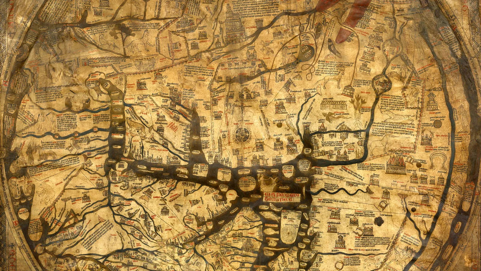
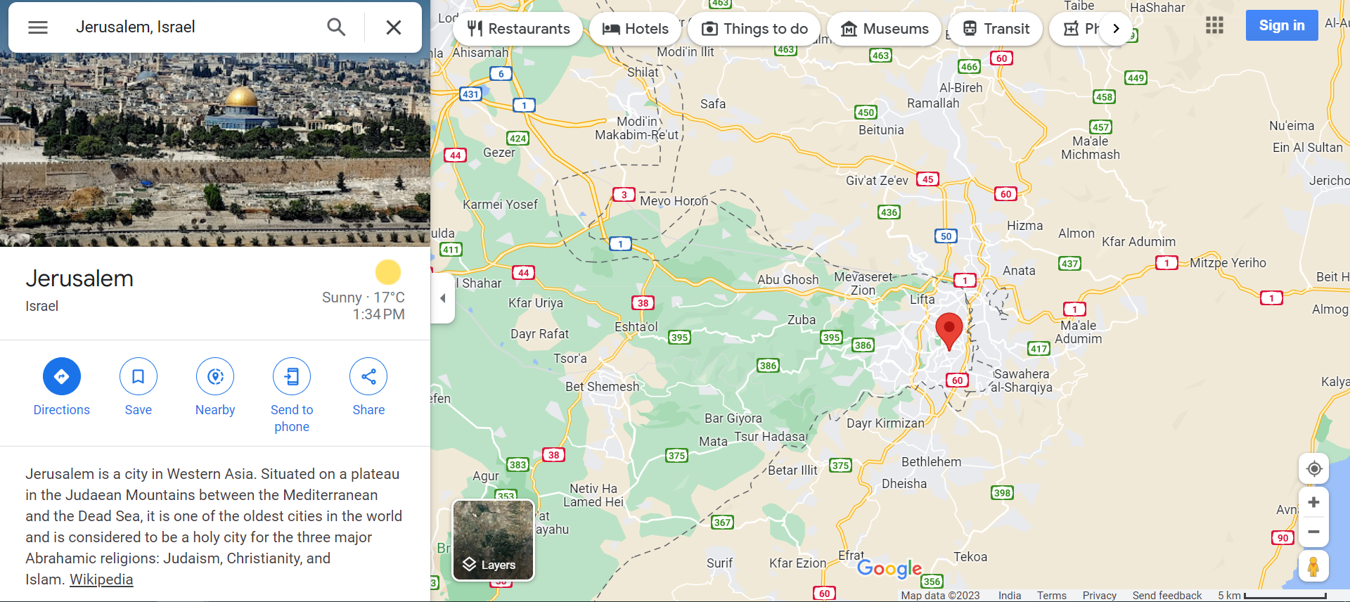
HEREFORD MAPPA MUNDI & GOOGLE MAPS
Despite being created centuries apart, the Hereford Mappa Mundi of the past and Google Maps of the present share certain similarities in their UI principles.
The Hereford Mappa Mundi, a medieval world map created during the 13th century used visual hierarchy to convey information. This was done by highlighting important locations with large illustrations. Google Maps applies the same principle of visual hierarchy by prioritising popular destinations and current traffic information.
Colour coding plays a vital part in both maps. Different kinds of colours were used for different regions, like blue for the sea and green for the land. The red colour was used to denote important cities and settlements while the gold colour was used for religious places. Struck a note with the present-day Google Maps’ similar colour coding techniques for mountainous terrains, roads and water bodies?
From the use of clear and concise navigation to the incorporation of bold and striking visuals, medieval design principles continue to inspire modern UI/UX designers. Who knows, the medieval inspiration you might be adding subconsciously to your design (we are not asking for credits, though) might be the secret potion to spell bind this world with your designs. But never forget to keep an eye on the future, always.