UX design principles have always been important in creating intuitive interfaces.
While UI focuses on the visual design of the product taking care of its aesthetics and layout while UX determines how effective the product is in achieving its intended goals.
UI Principles
User Control
Put the user in control. This means allowing them to customise their settings, providing clear navigation options and enabling them with undo options to reverse their mistakes/unintended actions. Putting the control in users’ hands with a sense of easiness makes them feel empowered and confident in their interactions with your application or website.
Hierarchy
At the simplest level, a hierarchical approach to user experience means thinking through all the functionalities and information that your product or website will contain and ensuring that the flow of interaction is natural. If implemented effectively, users easily understand the structure of your product, helping them find the information or feature they need quicker and easier.
Confirmation
Confirmation is about providing users with feedback that their actions have been successful or not. This involves using messages, pop-ups and visual cues to let users know that they have completed a task successfully or there has been an occurrence of error. By providing confirmation, you help users reduce frustration about their interaction choices and make them feel more confident to continue using your product.
Accessibility
Accessibility involves designing products or services that are accessible to and usable for as many people as possible, including those with disabilities. This involves using clear and simple language, providing alternate text for images and making sure your website can be used with screen readers. The move to prioritise accessibility helps you create a more inclusive and welcoming experience for all your users.
Usability Testing
The main thing to keep in mind – the design process is not over once you release your product or publish your webpage.
Usability testing involves observing users as they interact with your product or website and identifying areas for improvement. This allows you to get valuable feedback on issues like navigation, clarity and ease of use. It helps you make informed decisions regarding the ways to improve your product and march towards a more user-friendly experience.
BRIDGING THE MEDIEVAL AND MODERN GAP WITH USER EXPERIENCE


MORGAN PICTURE BIBLE AND THE GUARDIAN – ‘IN PICTURES’ SECTION
The Morgan Picture Bible, a 13th-century illustrated manuscript, used a combination of visuals and text to make biblical stories easy to understand and engage with. At present, The Guardian’s ‘In Pictures’ section is a perfect example to showcase the importance of providing engaging and informative visual content that is also easy to navigate and understand.
Both the Morgan Picture Bible and ‘In Pictures’ section of The Guardian demonstrates the continued and timeless relevance of UX principles in prioritising and creating a seamless UX experience.
Planes of UX design
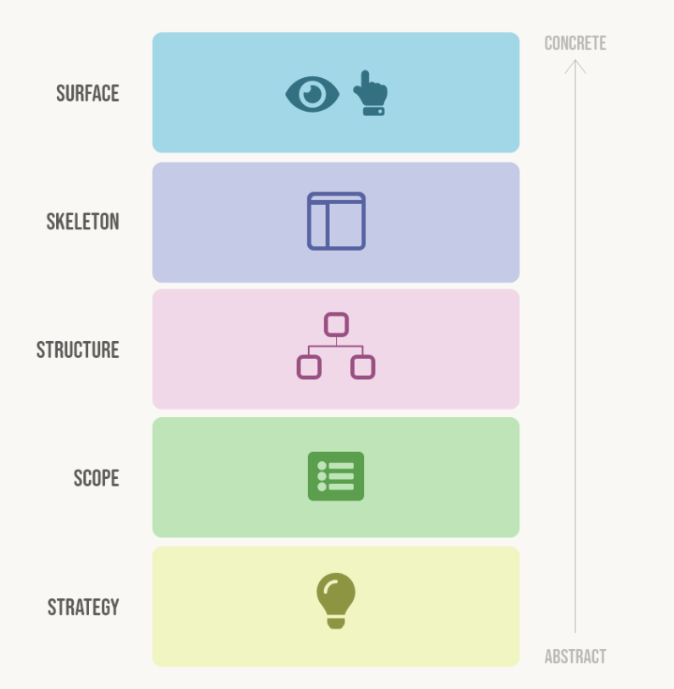
UX design is a multi-dimensional field that requires a holistic approach to create interfaces that are effective and efficient, also enjoyable for the users. The ‘Five Planes of UX Design’ model breaks down the design process into five different planes, each with its focus and goals.
1. Strategy
2. Scope
3. Structure
4. Skeleton
5. Surface

Strategy
UX design begins with a clear strategic plan, outlining the user’s goals, the business objectives and the overall vision of the product. It lays the foundation for the product’s UX design. This also sets the direction for the entire process of UX design, guiding decisions about everything from features to functionality of the product.
Scope
The scope of a UX design includes deciding the functional and content requirements of the product. This refers to setting the boundaries and limitations of what will be included in the final product and what will not be. This includes defining the target audience, outlining the features and functionalities to be included and making sure any technical constraints or limitations are brought to light.
Structure
The way the content and functionality of a product is organised comes under the structure part of the UX design process. The hierarchy of information, the navigation systems and the overall flow of the user experience are decided during this stage of UX design. The goal is to provide an easy-to-use and intuitive structure that the users are looking for in the desired product or application.
Skeleton
The skeleton is the foundation upon which the rest of the UX design is built. This includes the wireframes and prototypes that outline the basic functionality and layout of the intended product. The skeleton helps the designer test and refine the UX design before moving to the final stage of the design process.
Surface
The surface is the final layer of a UX design that the users interact with. This includes everything from the colour schemes to typography, finalising the overall look and feel of the design. It is essential that the surface should be visually appealing and consistent with the brand’s identity, while also being easy to use and intuitive. A good surface design is one that makes or breaks a product or application.
A good UI potentially attracts users, but it is the UX that keeps them engaged and satisfied. So, it becomes more essential to create a fine balance of UX with a good foundation to provide a satisfying user experience.


