Ittige Infra needed a brand identity that reflected its core vertical—construction—while resonating deeply with the local audience. By tapping into the cultural relevance of the Kannada word Ittige (meaning bricks), we set the foundation for a brand that stood out in its industry while feeling rooted in its origins.
Date:
January 2019
Project:
Scope of Work
.01/
Brand Name
.02/
Brand Identity
.03/
Brand Playbook
Creative Idea & Execution
.01/
Naming the Brand
The name Ittige was a stroke of brilliance, instantly evoking the concept of construction and a connection to local roots. It was simple, relevant, and memorable—everything a great brand name should be.
.02/
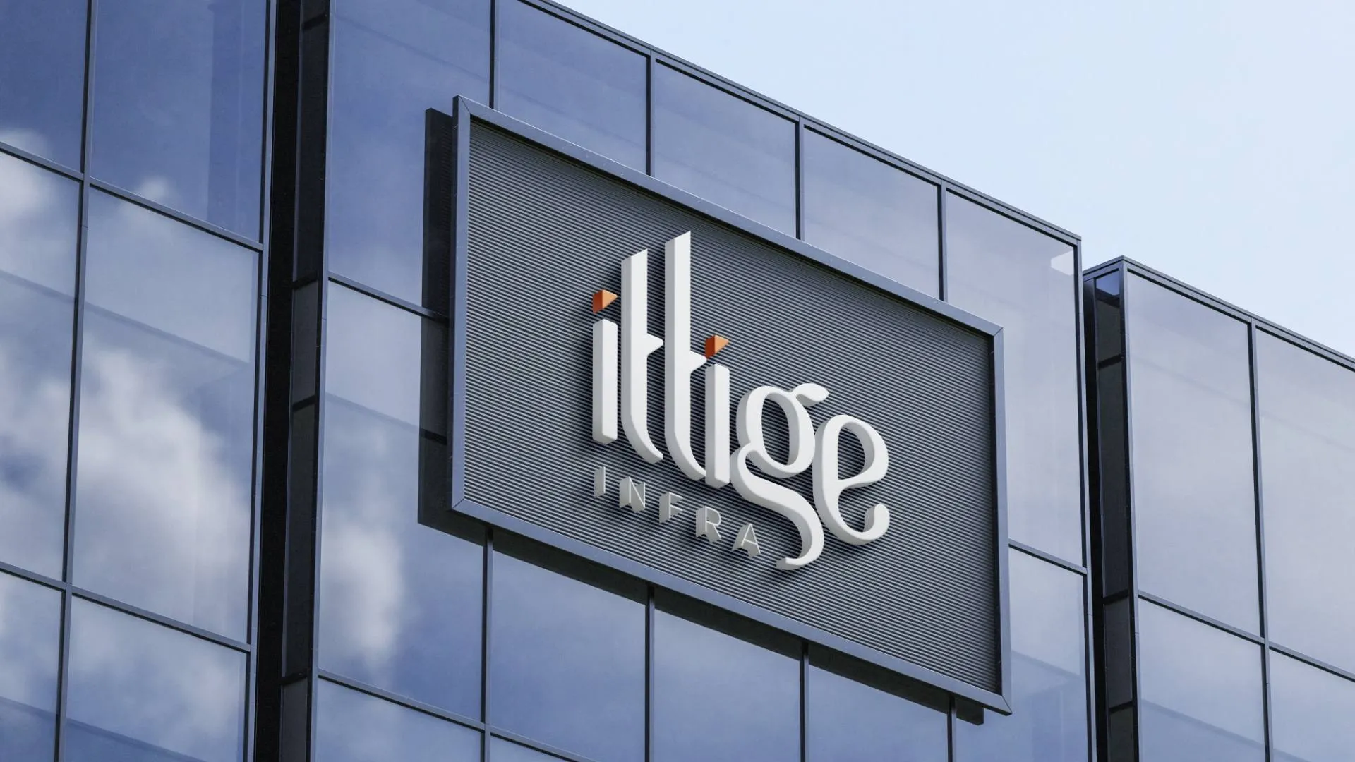
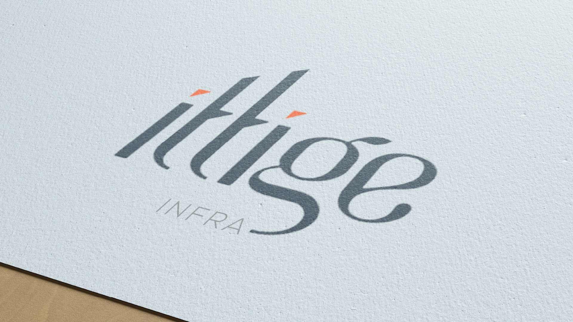
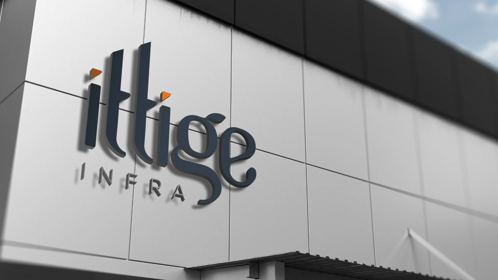
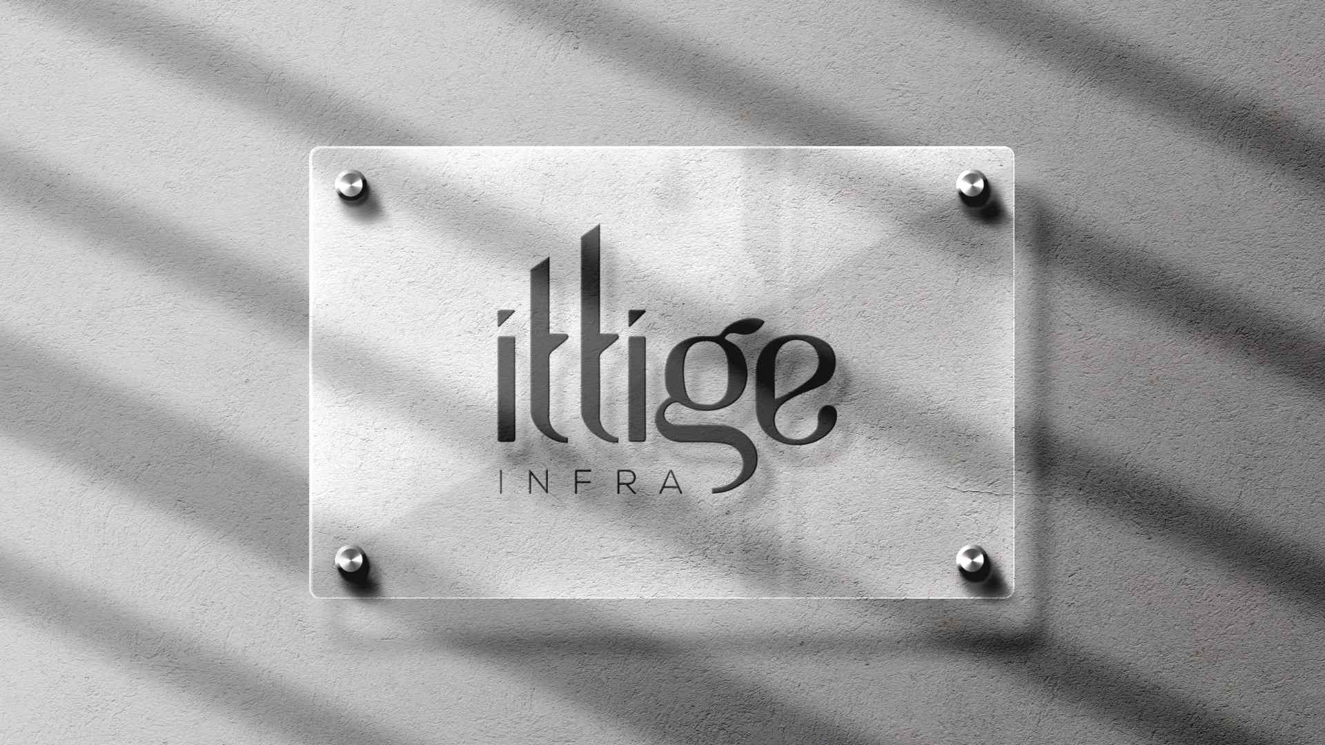
Logo Design
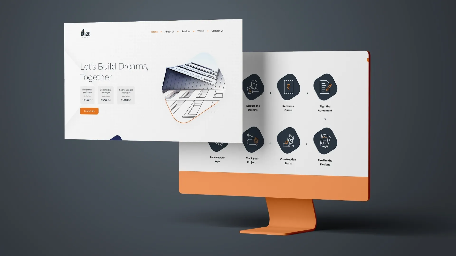
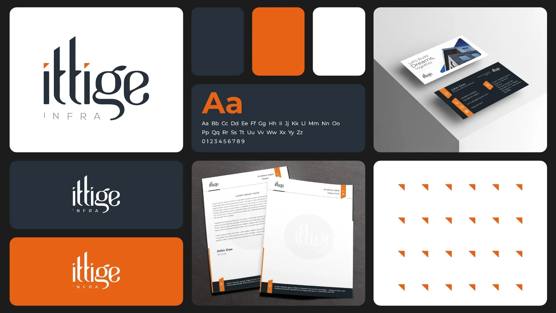
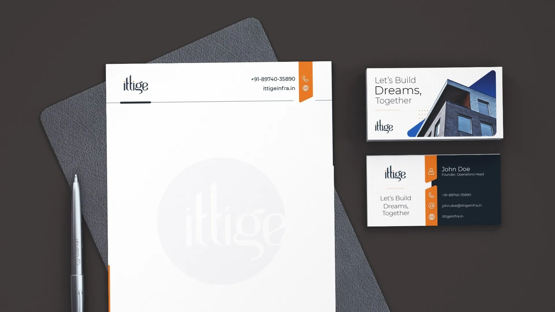
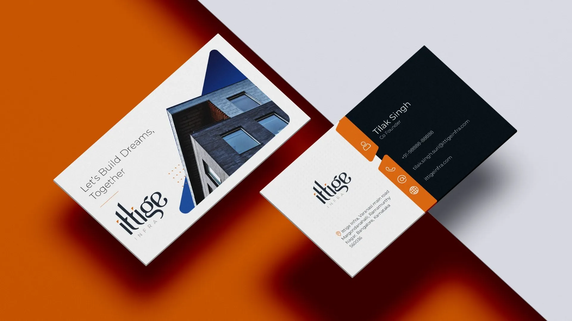
A bold, clean wordmark that aligned perfectly with the construction industry’s need for clarity and strength. The design was versatile enough to feature on everything from business cards to shirts, reinforcing the professional yet approachable essence of Ittige Infra.
.03/
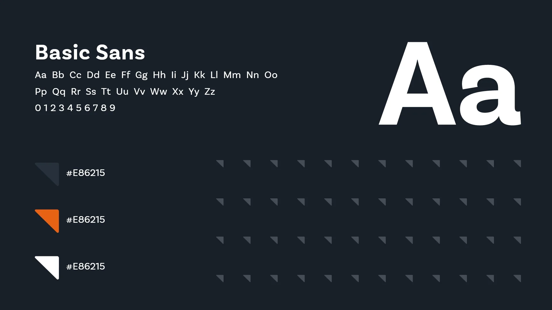
Brand Playbook
Comprehensive guidelines ensured consistency across all brand touchpoints, from stationery to digital assets, helping Ittige Infra maintain a cohesive identity in every interaction.
Results of the project
Distinctive Identity
The name and logo resonated strongly with the target audience, instantly connecting to the construction theme.
Increased Recall
The local relevance of the brand name made Ittige Infra easily recognisable and memorable in the competitive construction space.