Chill'd Monk - Panorbit | Think Digital

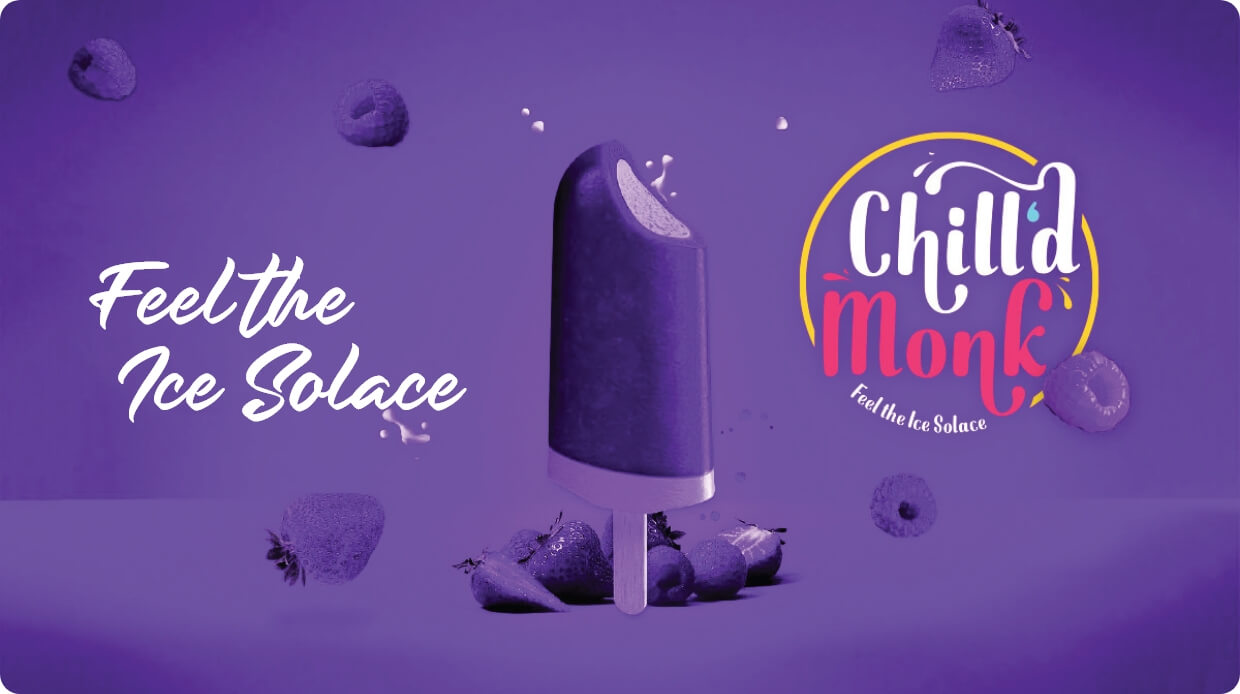
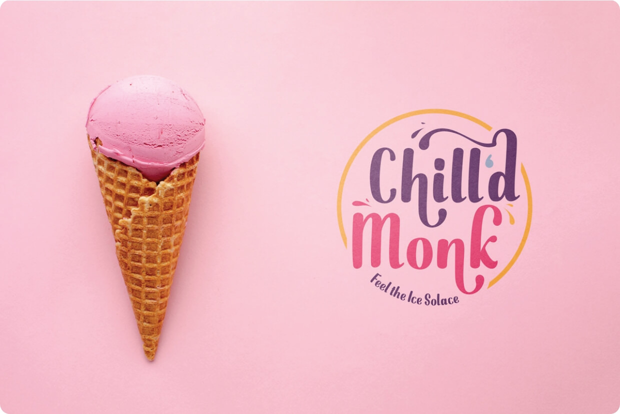
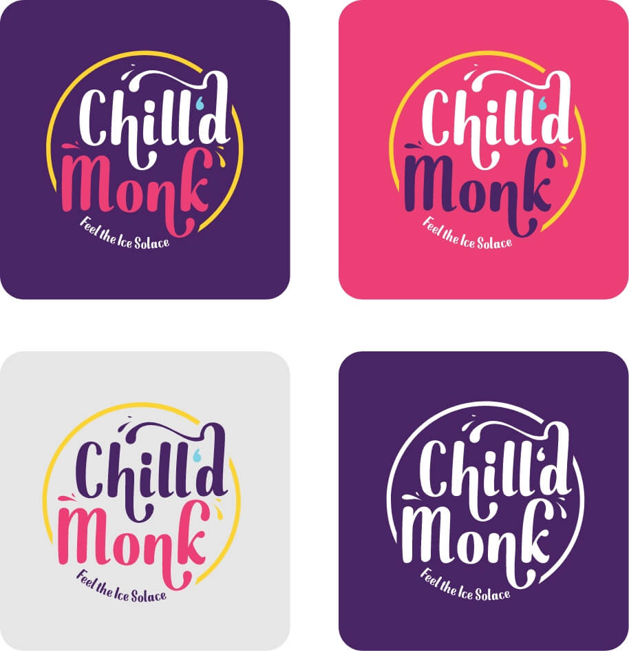
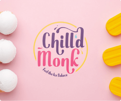
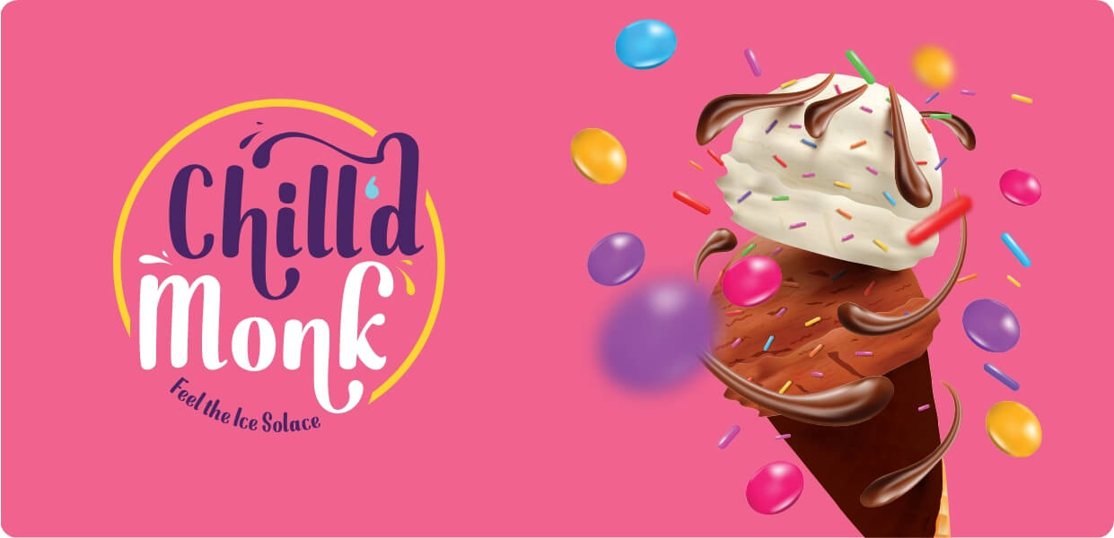
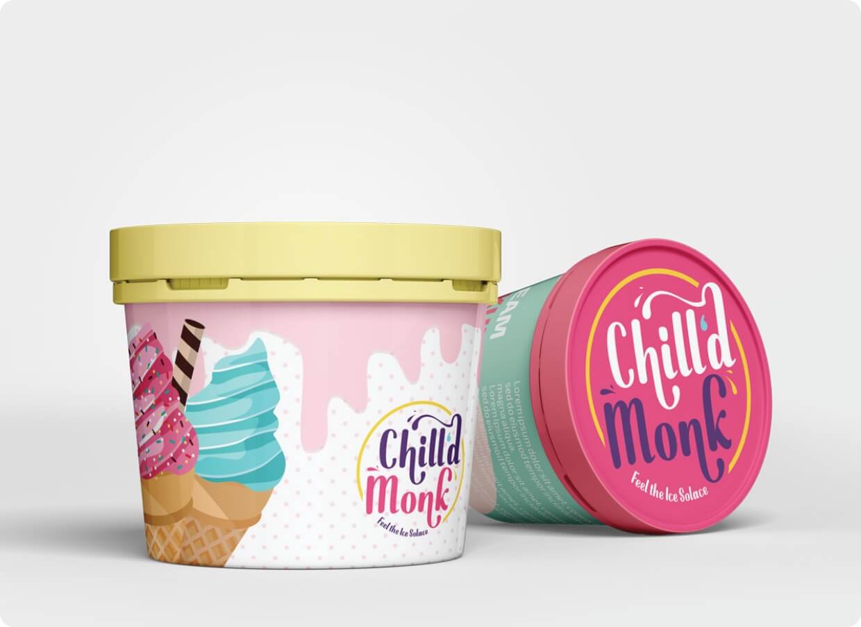
A Cool Product and a Cooler Client

In this competitive business world, logos are one of the primary tools to catapult our brand and business. When this popular ice cream manufacturer came up with the request for branding and logo design for their delicious business, we were all in with smiles.

The brief, clients had for us were conveyed with ice creams in our hands and the journey of Panorbit with Chill’d Monk began with a hint of yumminess.

Scope of Work

Coining the brand name

Logo Design

Brand Guidelines

In-store design

Eating lots of ice cream

Target Grouping

The target grouping was quite hard to narrow down initially. Come on, who doesn’t love ice cream? But taking the tough task on hand, we narrowed the target grouping into 2 major categories:

  • 1. Teenagers
  • 2. Families with Children

Both groups had their own reasons to visit an ice cream shop. An ice-cream date among teenagers. A post dinner ice cream catch-up for families. But this didn’t stop us from asking ourselves the popular question, ‘Who needs a reason to visit an ice cream parlour?’, on repeat.

Brand Name

The first hurdle in the journey with our cool client was to name the brand. Various choices were laid out on our meeting table room. One among the suggestions came with a sober twist to an existing monk (iykyk) and boom!

The uber cool ‘Chill’d Monk’was born!

Logo Design

Next up our alley was the logo design, the primary goal of our pistachio partnership. We were aiming towards a cool, bright and eye-catching logo. We wanted the logo to feel like the first bite of our favourite flavored ice cream in our mouth after a heavy meal. We truly felt it once the logo was done.

And how did we induce the target audience’s taste buds virtually? We aided the help of poppy and visually yummy colors. Our custom typography added to the vibrant feel we poured into the logo crafting process. Have a scoop of it, letting the logo speak for itself!

End-to-End Design Solutions

Once the logo designs made our client happy like grown up adults reminiscing their childhood memories of ice cream from their favourite vendor, we went on to define the brand guidelines.

Chill’d Monk parlours to get etched in the minds of Bengaluru people. The attractive menus, packaging designs and the digital designs too originated from the House of Panorbit.

Further, the in-store design was handled by Panorbit. The continuity from the logo design process aptly aided our mission of rocking the in-store designs of Chill’d Monk parlours to get etched in the minds of Bengaluru people. The attractive menus, packaging designs and the digital designs too originated from the House of Panorbit.

Working with ‘Chill’d Monk’ was an experience like no other for Panorbit. It would be minimal to say that it was an ice cream of a project for us. The client wanted to bring out happiness in the form of branding and we at Panorbit delivered exactly that.