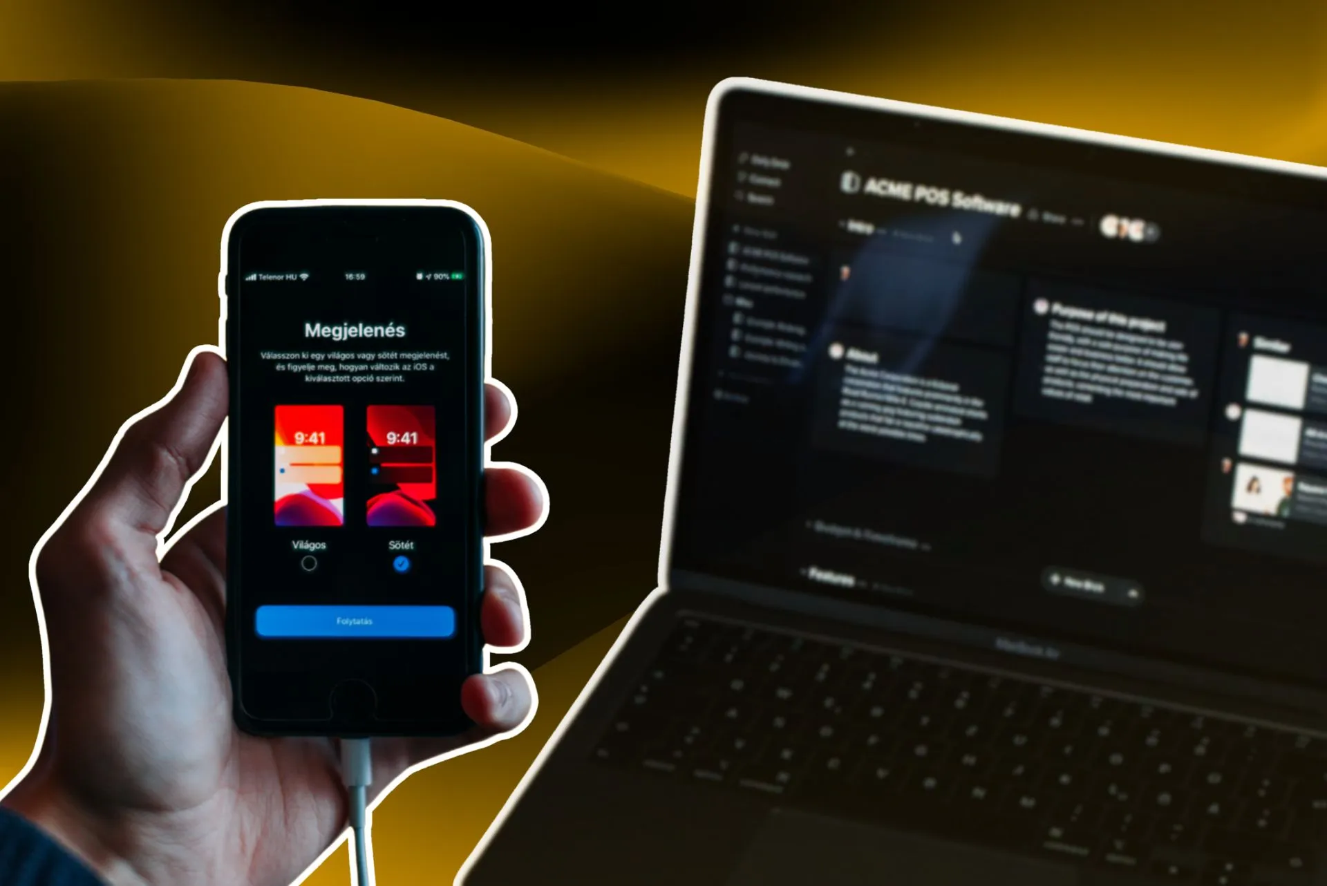
Do you want to hear a story of how the dark mode conquers the screen? This is the story of the trending dark mode with vibrant colours and illustrations so pleasing as on canvas.
The dark mode we’re talking about is a user interface (UI) design theme that showcases white text on a black background, unlike the traditional way (black text on white background). The dark mode appeals to a unique look and helps catch the user’s attention.
So, why the hype about dark mode? A dark mode portrays the image of power, sophistication, elegance, and luxury. It is seen everywhere, from mobile phones to TVs. With the advancement in technology, big companies like Apple and Google offer their users the choice between light and dark modes. Even more, dark mode is loved by coders as it helps them focus individually on different parts of the screen.
History of the evolution of Dark mode
Is dark mode a new invention in UI design? Let me correct you right there. Rewind a bit and come to the 19th century. The first programmable computer Manchester Baby (1948) was powered by CRT (cathode ray tubes). The CRT technology wasn’t efficient enough to have colour backgrounds, and hence in the first computers, a dark mode was the only option.
The dark mode was not a recognized term back then and was instead known as night mode. Till the late 1980s, computers only used dark mode, and after the Apple II launch (1977), it displayed a wide range of colours. With the evolution of LED and OLED, we have come a far way in advancing technology in comparison to CRT. Yet, there is still some similarity between the old and new dark mode versions.
Benefits of a dark mode
1. Mysterious feel: Black backgrounds give a professional sense, and colours are more vibrant against black. It also helps illustrations to stand out.
2. User focus: The black canvas is attractive to the user’s eye showcasing the elements of design and copy in an enhanced illustrative way.
3. Battery life: Studies show that an OLED-equipped device can save up to 24% battery life in dark mode.
4. Unique: We all have formed a habit of reading with a white background and if that is switched with a black background it differentiates from the usual and becomes more appealing to the eyes.
Dark mode is conquering our screens
The first-ever adoption of dark mode in an operating system was by Apple’s system 7 OS in 1991. Apple’s adoption of dark mode brought about a new change. The applications were given a new dimension in colour, context, and look.
With the appealing look and unique features, Google also gave in to try the dark mode, followed by many other companies. Today some applications like Spotify use the darker side of shades. Microsoft Outlook, Apple, Reddit, Gmail, YouTube, Pocket, Safari, and Android phones have also incorporated dark modes.
When we talk about the dark mode, we can credit the coders who made it famous. Due to working on large computers, the light mode was very bright for people working in control centers. Thus, the benefits of battery saving and less eye strain came noticed with the dark mode. Technical developers go way back with using this mode, with code editors only preference being a dark theme or mode.
The current rise for dark user interfaces (UI) has increased rapidly as the screen time for individuals has gone up more than before. If we talk about Adobe users who spend hours on screen, opt for a dark mode due to its benefits and less light striking in the eyes. The trend of the dark mode is taking giant leaps causing websites and applications to take a step forward in UI design. This change has led website designers to keep in mind the consideration required for their UI design and brand.
Implementing UI design depends on the user preference, leaving the company with a choice of either investing dark mode in an application or not. It is always good not to take risks with applications that can cause entry errors like online banking services. With the trend of dark mode, the right time and use can gain customer traction.
Let us explain with a dark-theme applications example below that caused a difference in user preference and became a sensation in dark-theme UI:
Apple
Apple launched their new Air pods Pro with a fascinating work of art using the dark mode UI. The glimpse of white air pods is shown on a black screen coming through the shadows and then disappearing in the black screen. This to-and-fro happens with every distinctive feature mentioned as you watch forward. The text in white against the black screen pops out, making it look attractive and luxurious. Apple Air pods pro has set trends, and this trend is worth following to improve the brand’s products and visibility.
Conclusion
Grabbing audience attention to your website and designs just got more interesting with the dark mode in UI design. It has an attractive look on websites and mobile devices. Though light mode has always stood out but in many cases when dark mode is implemented properly, it clearly stands out as a winner. It is a retro trend taking over the global market and now is the time to carefully execute it to your design according to your product and services.


