




Let’s move faster,
smarter, together
Scope of Work
.01/
Brand Name
.02/
Brand Identity
.03/
Brand Playbook
.04/
Packaging Design
Strategic Thought
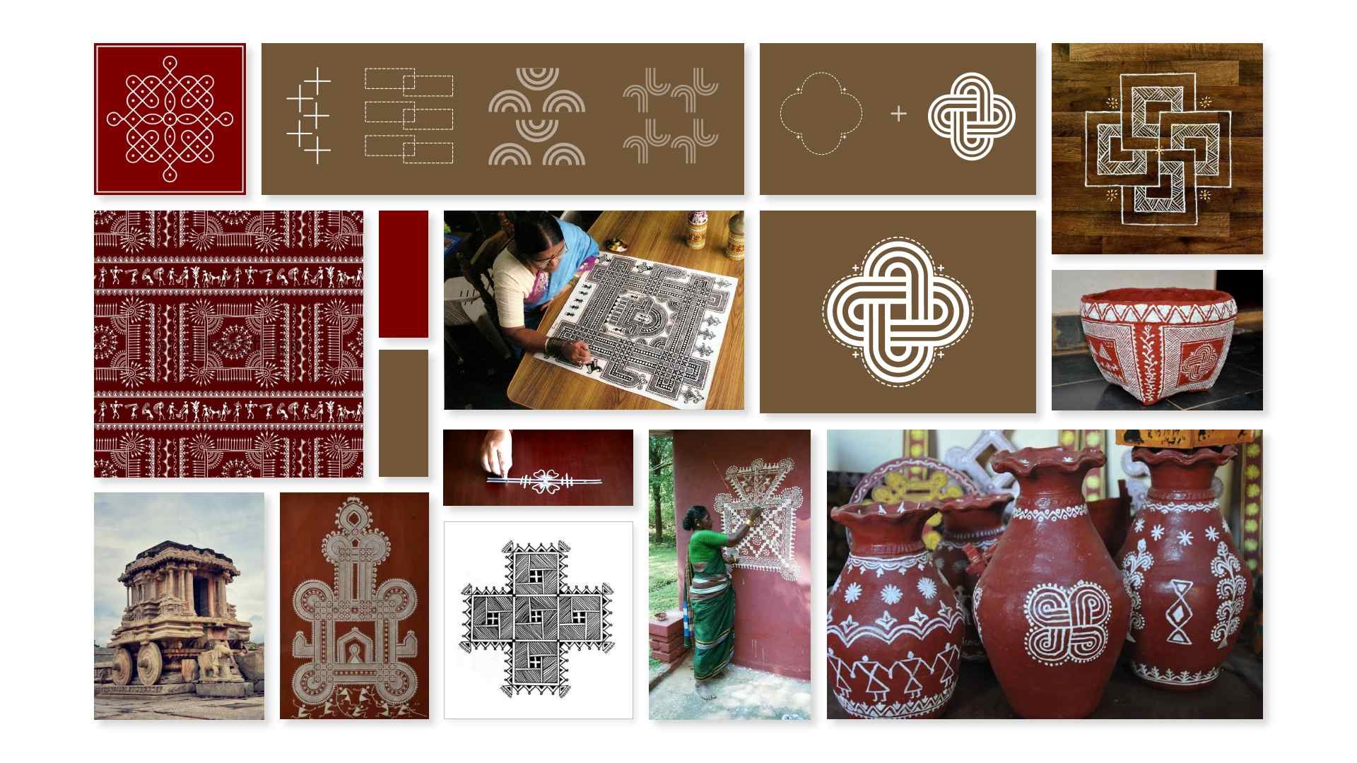
The challenge was to create a brand that reflects Stoka’s dual mission of offering unique products and championing sustainability and empowerment. The brand needed to speak to the modern conscious consumer while honouring its Indian roots and the artisans behind its creations.

Creative Idea & Execution
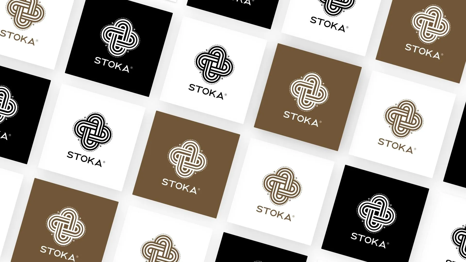
The name Stoka, derived from the Sanskrit word for drop, was chosen to symbolise sustainability—small actions that lead to big changes. It also connects deeply with Indian culture, reflecting the brand’s roots and ethos.
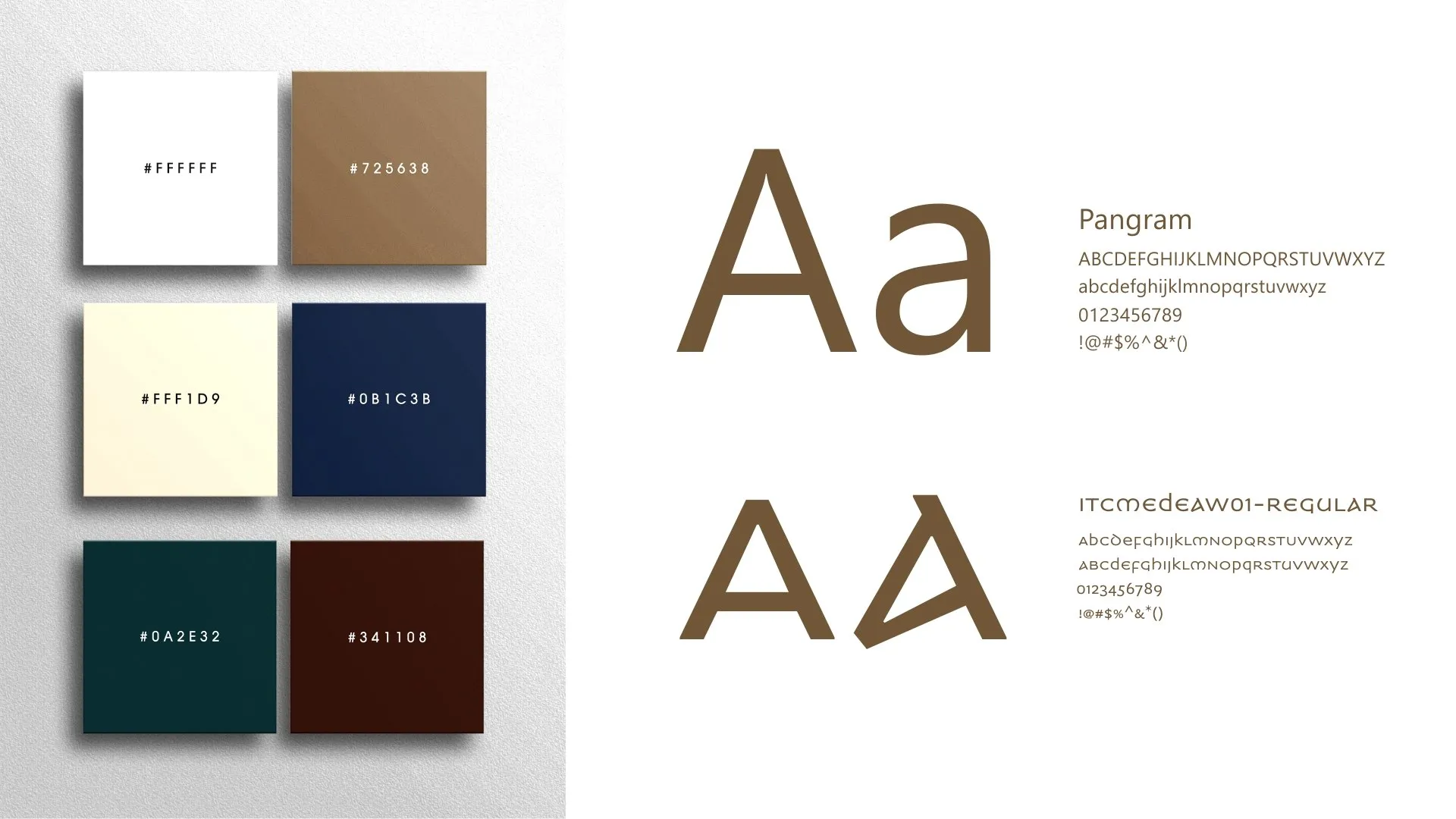
The packaging design was crafted with sustainability at its core, using eco-friendly materials and minimalist aesthetics to align with the brand’s vision. The playbook detailed how to maintain consistency across all touchpoints, ensuring that every interaction with Stoka reflects its mission and values.


Results of the project
A Strong Identity
Increased Artisan Visibility
Sustainability Leadership


